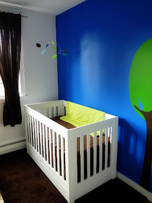
Showing posts with label Modest Modern. Show all posts

25 February 2013

bathroom [tile]

Inching closer to the finish as tile begins...

First the shower tile:
P1080689

P1080712

P1080713

Then the Nuheat mat goes down directly on the subfloor:
P1080626

Schluter DITRA over that:
P1080691

And finally, the floor tile:
P1080717

14 February 2013

bathroom [planning & material selection]

P1080374

As you can see by looking at the Redux List on the sidebar, a complete bathroom remodel had been in the works since we purchased the house in 2008. And we had been saving links and pictures of ideas and inspiration along the way. Nonetheless, we still viewed the start date as a year or two away. However, there were two issues that drove this project to the forefront.

We believe the previous owners renovated the bathroom in the early-90s. That meant by the time we moved in, the toilet was approximately 16 years old. Almost from the start, it was apparent that the closet flange had rusted and the toilet was not securely fastened to the waste pipe. Two years later, the tank developed a leak. Although I could have replaced the gaskets and tank bolts, with a remodel down the road, I decided just to order another Toto Aquia. When I pulled the old toilet, the cast iron flange was completely toasted and I couldn't get a replacement ring fastened down because the subfloor did not hug the waste pipe -- so there was nothing solid to fasten it to. I tried my best with some blocking, and it held for a week (or two), but soon loosened again. Plus there were issues with the unique Toto flange adapter and the levelness of our floor such that I was honestly afraid that we would crack the porcelain on the toilet every time we gingerly sat down on it. When the plumber was there to finish the kitchen, he gave me an $800 quote to fix it. No way were we throwing that kind of money into a temporary fix when we knew we were close to a complete gut remodel.

The second issue involved the shower's water valve. It was approximately 16 years old as well and within the last 6 months, had become very temperamental in fully shutting off the water. And I'm not talking a drip (or even a fast drip). I'm talking a low flow stream of water coming from the spout when in the OFF position such that you'd have to turn it back on and off a few times in order to catch it just right. I feared that at any moment, we'd using the angle stop valve (accessible from a small access door in a bedroom closet) to turn the water on and off. Although I didn't get a quote on this repair, I assumed it would be a substantial undertaking and again, we didn't want to dump money into a short-term fix.

So as soon as the lower living room project wrapped up the end of November, we dove head first into planning the main bathroom. It was an intense time to plan a complete bathroom redux. A bullet list will make it easier to digest:

-Went through all our links -- kept the good ones, got rid of the bad ones
-Viewed our inspiration photos and jotted down our favorite ideas in a Word document
-Decided on a contractor (a process I explained in more detail here) and ensured that he was available and could complete the project on our tight timeline
-Visited R.F. Fager & Company, a local bathroom showroom/distributor our contractor works with and started building a materials quote list. Although I had already sourced many of our materials/fixtures, there were still some holes to fill, and I found that working with folks who do this for a living has advantages to simply researching and ordering everything online. In the end, I had a great experience working with Fager's.
-Visited every tile store within 10 miles of our home -- pulled samples from different ones and got prices while we were there
-Visited Fagers, Home Depot, Lowes and Just Cabinets to look at various cabinet options. Every store had something a little different to offer at different price ranges. Obviously some places (Fagers and Just Cabinets) were a bit more knowledgeable than others. Did layouts, got pricing and lead times (so important when you're on a tight timeline) at Home Depot, Fagers and Just Cabinets. Went through a number of redesigns at Fagers and Just Cabinets after meeting with our contractor.
-Visited nearly every countertop fabricator within 30 miles to hunt down a quartz remnant -- ultimately failed at this and ended up deciding on a new slab from Lesher Marble -- the fabricator that installed our kitchen quartz (and the first place we visited)
-Developed a specification list in Word that covered our desired materials, demo, rebuild and design choices. This spec list was heavily edited during the entire planning process and it was used as the main document when I did the walk-through with our contractor so he could develop a quote.
-Finalize material selections (cabinets, fixtures, tile, countertops) and get firm quotes to contractor.
-Review contractor's quote, let the initial shock wear off(!), get back with your contractor on questions/issues/possible cost cutting areas and then sign the contract and cough-up the down payment

Again, this is a bullet list. We hope to discuss more of these in detail in future posts. As we mentioned, the process started in late-November and we signed the contract in mid-January. Ideally, we would have loved to have taken three months to flesh out the details of this project, but the issues above and our second child due in early-March dictated otherwise.

If you've read along this far, we believe you deserve a peek at our final material selections. Shower tile on left. Countertop on left. Floor tile on right. Cabinet (Java Stain on Cherry wood) in back. Along with the various paint options.

P1080377

01 September 2011

[modern] cornhole

cornhole5
So the kid is turning one and we needed another yard game for his party. Wanted to go with a classic -- cornhole. Located a detailed set of DIY instructions and went to work! Everything except the hardware was sourced from my garage -- leftover birch plywood from a nursery project and 2x4s that were actually left behind by the previous owner.

cornhole6
I wanted to go with a classic, modern look for the board -- using walnut stain on the birch (finished with a water-based, semi-gloss poly) and high-gloss white paint on the frame and legs. I considered making it primary red or blue for the kids, but something inside me yearned for a more modern and timeless cornhole board!

I was planning on making two boards, as the instructions call for, but decided that we really had no need for two -- we'll simply have a foul line marked by a stick (or some other item laying around the backporch), make the tosses, retrieve the cornhole bags and then make the long (27 foot) walk back to the foul line. [Cornhole purists around the world shudder.] Official rules here.

My wife was tasked with making the cornhole bags...but life took over, the party date was nearing and we decided just to order them. We're very impressed with the color and quality of the ones we purchased.

And the best part...
cornhole4
The newly-minted one-year-old approves! Good times.

11 August 2011

Modern Stairs

Modern stairs come in a wide array of shapes, materials and designs. And I've seen some amazing ones out there on the interwebs -- too many to even think about listing. The photos below happen to be our inspiration shots for stairs that we believe look beautiful, are designed well and work within our modest modern renovation scheme. 


Unfortunately, I don't have credits or sources for either of these photos. We're leaning toward the bottom design and I have requests for estimates out now -- one using walnut, another using oak (that would be stained a walnut or ebony color).

Before I go, I should also mention the finish of the wall around the stairs, as seen above. It brings the wall flush (or almost flush) with the stair casing. Here's a better detail shot of that, and another great set of stairs, from the guys over at BUILD Blog:

This look is achieved using a shadow bead or "Z" reveal mold on the edge of your drywall. I'm planning to use this molding throughout the kitchen redux and hope to provide more detail -- from a DIY perspective, of course -- once the project gets underway.

20 May 2011

nursery

You may recall the peek inside the nursery from a while back. We finished the room shortly thereafter and the little guy arrived in September; but the first-time parent thing kicked in and it's taken us a while to finally capture some pictures of the room and get this post together.

We didn't stray too far from our design board, just the typical subsitutions when you can't source a certain product, find something better or simply don't want to spend the money on another one (I'm talking to you, Eicho Crib).

Although my wife made a lot of the design calls, let's face it, the true foreman on the job was our cat. Big thanks to Chance for your excellent leadership throughout this facelift of a project!

Let's talk paint first. This room had a short-lived stint as an office, whose walls were painted using Behr's Ultra Pure White so we would have a blank slate to work with later. So all of the white you see in the nursery remained the same. The major splash of color came in a deep blue feature wall, which would anchor the white crib. We choose PPG's pure performance -- its a zero VOC paint that received excellent feedback on various online professional painter forums. I echo these reviews -- excellent coverage, true color and no noticable odor. Cobalt Stone is the proper name of the blue, and Leap Frog the green, which you'll see in later pictures.


We'll start the tour of this small room at the aforementioned crib. Regular readers of Apartment Therapy's ohdeedoh should recognize this at the ever-popular, low-budget/high-quality BabyMod Parklane. We loved the clean, simple, modern-look. And the drawer on the bottom added valuable storage in the small space. Speaking of that drawer, it's a hack of sorts, although the only thing I did was slap on a few coats of the Ultra Pure White High-Gloss to cover the original honey-stained drawer front. The rug, curtains, rod and blackout shade are all IKEA grabs. My wife made a skirt for the crib (needed when raised to the highest mattress position) using the excess fabric from the curtins. Oh...and the perfectly modern mobile is the Big Dipper Baby Mobile (small) from The Wonderland Studio.

We thought about painting a tree on the wall, but decided that we liked the clean lines of a vinyl wall decal from Leen the Graphics Queen. Leen was great in working with us on a custom size and sent out tons of color samples before we placed the order.

A simple turn of the head takes us to the next stop on our tour. I could make up a catchy name for this corner like "the reading nook" or the "chill corner," but let's face it, when the boy was little (0-6 months), we rocked him to sleep and did a few feedings on the IKEA rocker -- the IKEA bookcase just looked cool. Now that he's bigger (8 months), he pulls himself up and stands here by himself, tortures the cats when they lay on the rocker and pulls most of the books off the shelves and toys out of the baskets; and that's only when he's not trying to get into the trash can next to the dresser (which you haven't seen yet).

The rocker, which I suspect has been discontinued because I can't find it on the website, is fairly comfrontable for putting the kid to sleep, but not so much when you need to get up while holding said kid -- its a bit low to the ground and deep in the seat. We're looking forward to the book readings that are sure to happen in the future. You know, the ones where the kid can jump on and off your lap without you having to pick them up and put them back down!

Also note the bear on the bottom shelf -- mine from when I was a kid. His name is Bandit, after the dog on Jonny Quest (one of my childhood cartoon favs)!


A closer inspection of the featured art in this corner reveals more vinyl, this time Birds On A Wire Squares from Byrdie Graphics. In their truest sense, they are meant to be adhered directly to a painted wall, but we wanted to add a bit of visual interest to the wall. So we purchased a sheet of birch plywood from the Home Depot and had them cut it down into squares. After a bit of sanding, we slapped on the Leap Frog paint, installed the hanging hardware and went about hanging them as level as possible. No magic or special tricks to speak of, just a Hang & Level, a touch of math and a little patience! 

Let's see...modern piggy bank from Amazon.com (I believe) and the beautiful wooden stacking toy from Little Sapling Toys. Paired with some plastic greenery and one of our favorite reads, no matter your age!

Our final stop on this short tour does require one to turn in place. Hopefully you're not exhausted, yet? IKEA MANDAL -- this dresser not only looks great, but it's a pretty solid piece, as far as IKEA furniture goes -- solid birch casing with solid birch drawer sides and backs. A pretty nice piece that should take us well into the teenage years. But make no mistake about it, the star here is the BabySmart Cooshee Changer (Lime). We absolutely, 100% love it, recommend it and can't imagine diaper changes without it. 


We leave you with an unstagged shot of what the nursery looks like on a pretty average day, just imagine a few more books and toys strewn around the floor these days!

17 January 2009

Ikea Hack

I'm the type of person who would go 3 years without a necessary piece of furniture solely based on the fact that I could never commit to a piece that will essentially become a permanent fixture in the house. My wife, on the other hand, is not.

So when we moved into the house back in March08 and found ourselves in need of a TV unit, I was perfectly content to use a sturdy box and begin the long search for the perfect, affordable piece. My wife, on the other hand, was not.

Scene shift. So we find ourselves in the middle of IKEA wandering around looking for a solution, a middle-ground if you will. We settled on the BONDE TV Unit, but only if I could change out the hardware and paint the two front drawers a glossy white. Both parties agreed.

And here's one for the "Don't Try This At Home File"

When we bought the TV Unit, I purchased a few packs of the BESTÅ casters. My plan was to install one on each corner and another in the middle for support. The idea was to get the unit off the floor a bit, add a little character and otherwise compliment our Blu Dot Chicago cocktail table.

From the moment I opened the box and saw the bottom of the unit, I had this gut feeling that it wasn't gonna work. It's not like I was expecting the bottom piece to be solid wood or anything, but it wasn't even solid particle board. (!!!) Rather, it was a thin piece of "sturdy" cardboard with that "waffle" cardboard filler.

But the lure of the finished look that existed in my mind was too much -- so I dived in with a drill bit and some Gorilla glue. I let the casters dry upside down for 24 hours and flipped it over to see if it would stand. Surprisingly, it did. But not for long.

I'll spare you the messy details, but it involved my wife and I tying to save a 165 lb. 32" TV from crashing into the ground when the less-than-soundly-attached casters gave way under the weight of the TV as we were rolling the unit. Somehow we managed to save the TV, but the hack was a bust.

Nonetheless, I was determined to make the casters work. So I purchased up some nuts and washers from the local hardware store and a wide, hollow drill bit. I drilled the holes and fastened the nuts/washers to the casters, hoping to get enough surface area to adequately secure the casters to the unit. Had the bottom been at least a strong particleboard, it might have worked, but the thin piece of "sturdy" cardboard just wasn't strong enough and I had to scrap the idea.

Here's the close-up:


Related: Plastolux's TRÄBY Hack

15 July 2008

Out Back

Before we were married in March, we had seen a patio set at Ikea that we liked and hoped to buy later that Spring. However, given the fact that the closest Ikea is 2 hours away, the rising cost of gas and busy schedules, we weren't able to make the return trip until mid-June. Much to our surprise (and my wife's extreme dismay), they had sold out of our set and wouldn't be getting any others in until next Spring. We did pick up two of the lounge chairs we wanted at amazing savings of $50 each!! So the trip wasn't a total loss.

I was content to wait it out until next year, but Angie was really excited to get outside and make use of the back porch. So...the search began for a unique, modern-looking and moderately-priced patio set. She scanned the far reaches of the Internet and came up with a bunch of ideas. We were looking for a mix of teak (or other hardwood) and aluminium. However, most of everything we found and liked was considerably out of our price range. We talked about settling on something we didn't totally like, and we almost caved...

But we held out...and a day later she found the Stack Chair Depot. They had a chair that we liked better than any we had previously seen. And although the tables were small and all wood, they matched nicely and were priced right. So we picked up two of the tables and six chairs. Upon delivery we found that the table legs were actually painted with a faux wood grain effect -- so before we put them together a quick trip to ACE Hardware to pick up some aluminum-colored spray paint. We sprayed them later that evening and had them together the next morning. We are extremely pleased with the finished result.

My mum -- using her mad sewing skills -- hooked us up with these custom-made covers for the boring black-and-white striped coushions we bought at Ikea to add a bit of comfort to the lounge chairs. We also picked up a Lack side table -- I mean seriously, for $12 you can't go wrong!


20 June 2008

For Starters...

Kingswood is the street where we live.

Redux (from the Latin, meaning brought back) is what we're doing to our 1958 split-level house. In a sense, it's our new interpretation of the design elements in both the interior and exterior of the house in a style that we call modest modern. Modern in the sense of strong, sophisticated, clean and simple lines that draw inspiration from mid-century modern design, but yet appreciating where we've come in the 50 years since. Modest in the sense that we both believe our money is not our own and thus, we consciously choose to make economically-sound and practical decisions concerning the use of those resources.

Kingswood Redux is the blog where we share that process with you. It is our intention to share pics (before and after), stories, links, resources, methods, what we learned, frustrations, etc., when we're not otherwise working on the house, at our jobs, serving others, or enjoying time with family and friends! And just for the record, this blog is not about keeping up with the Jones' or even other remodeling bloggers who we draw inspiration from. It's simply an expression of the creative passions that have been seeded deep within us by our Creator.

We are Troy & Angie. And we are blessed to have you along for the journey!